Creating good speaking presentations, a simple guide.
As a product manager, you are often asked to present: product demos, new features, product strategy, roadmaps. A quick ‘slide.new’ in Chrome opens up Google Slides and you’re off. But if you’ve gotten into the habit of opening a blank slide as your first step in creating a presentation, let me introduce you to a more effective method.
Before Google Slides: Microsoft PowerPoint
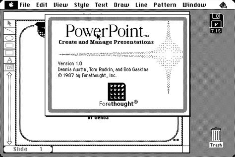
In 1987, Robert Gaskins and Dennis Austin created PowerPoint for the Apple Macintosh.
Everything was black and white and could be printed onto transparencies for an overhead projector.
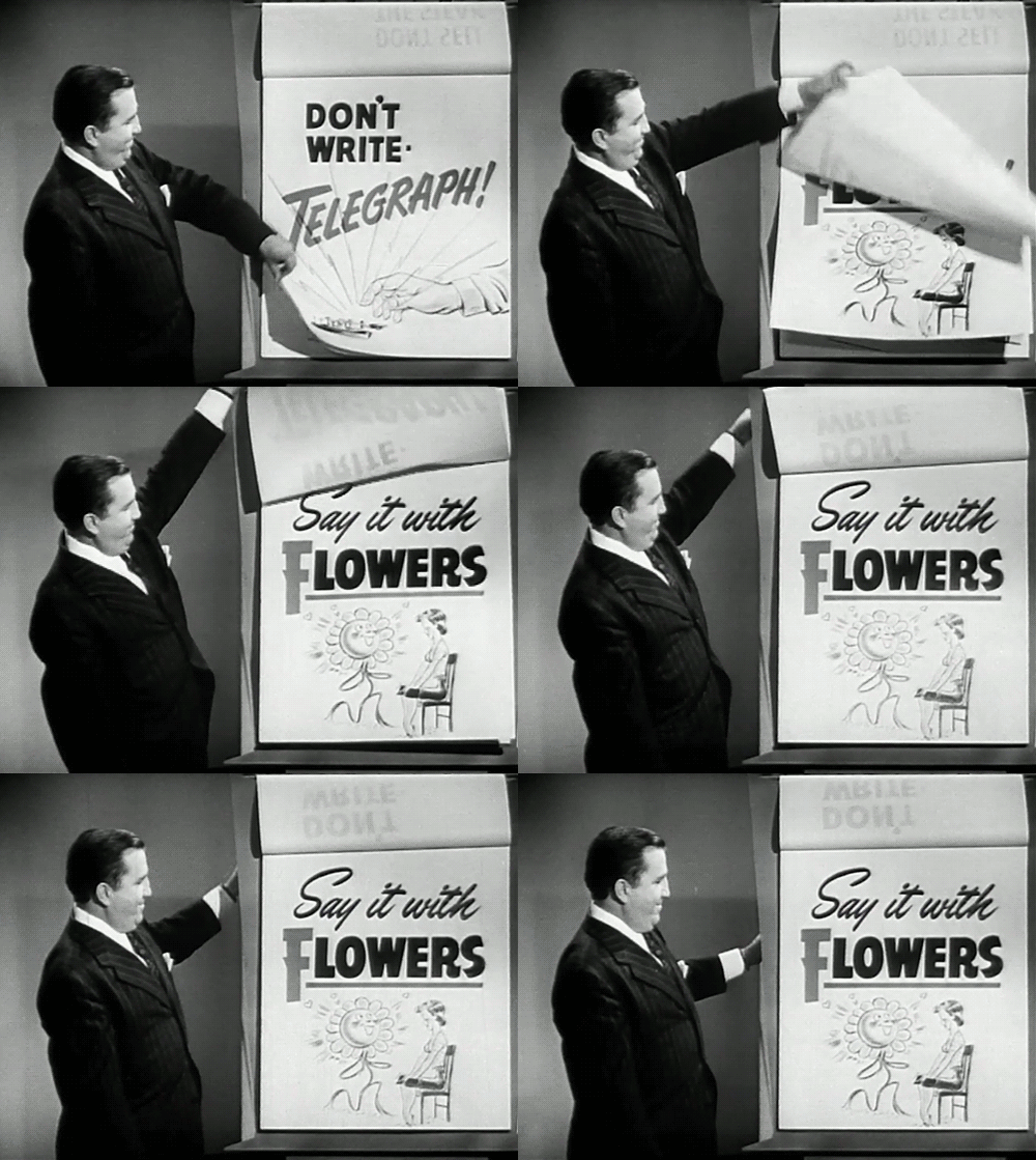
The technology certainly has improved: color, animation, even collaborative editing. However, the fundamentals for using slides to augment a spoken presentation haven’t changed from the day of flipcharts.
What is a presentation and where do slides fit?
A presentation is about communicating ideas. In that context, slides are the visual accessories that help accentuate our ideas.
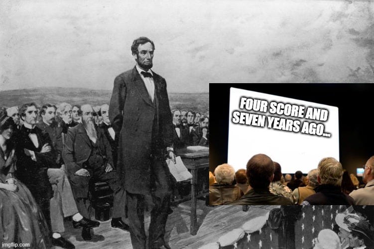
But slides aren’t your ideas by themselves. People give presentations without slides or any visual aid all the time - speeches.
Principles for good presentations
Start with Google Doc rather than Google Slides to define your message
Ditch the blank slide. A presentation is about communicating ideas, so we have to start by defining what we want to communicate. Open up a word document and start typing. The blank page frees you from the minutiae of slide design (e.g., layout, visuals, color). Have an idea for an image? Great, write down the idea. Write in bullets, paraphrases, or paragraphs. Explore divergent thoughts. Document what you want the audience to take away. One reason a presentation is confusing or boring is because the presenter isn’t clear on the message.
Evaluate if you’re creating a presentation or slideument
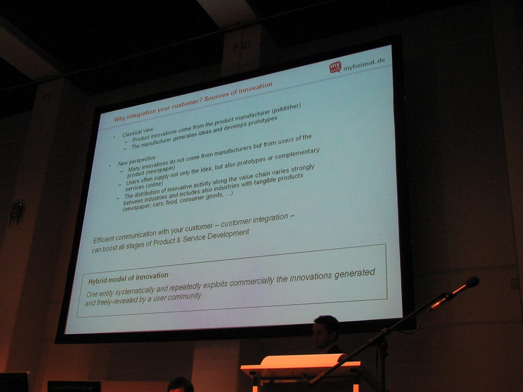
As slides become more ubiquitous in the workplace, it’s replacing word documents for the wrong reasons. Garr Reynolds calls these “slideuments”, a word document broken in slide format.
If you’re hosting a working meeting or memorializing a decision, you don’t need slides. Stick with a word document. Better yet, because you started defining your idea in a word document, you haven’t wasted any time on slides if you decide to forgo them. You can splice up that word document with visuals, just like a slide.
Think about your audience
Presentations are for people and different people will be attending for different reasons. Answer these questions about your audience. Then, adjust your message to fit the audience.
What kind of people will be there? (e.g., coworkers, clients, general population, prospective employees)
What kind of background will the people have? (e.g., education level, working experience, life experience)
What kind of information will the audience have about the presentation beforehand? (e.g., experts in issue, not informed)
Why is the audience attending? (e.g., seeking solution, looking to give input, be entertained)
Create a storyboard with headlines and visuals
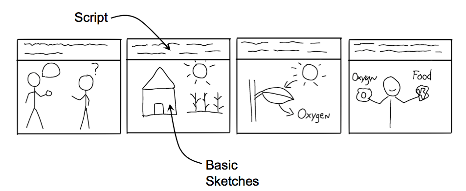
Review your word document and write up a script using a storyboard. You don’t need any fancy tools or index cards. Here’s a Storyboard Template for Google Doc. Once done, you can organize your headlines sequentially to see how your presentation flows.
Write headlines, not titles.
“Table of Contents” is a title. “New customer segmentation methodology explained in 5 parts” is a headline. See how the headline provides more information and can do the same job as the title?
Show visually, not just with words
Ask yourself, if I could pick one image that would articulate the same information as the headline, what would it be? Print out your Storyboard and draw it. Remember, the slides are accessories to your ideas.
Write your talk points
Unless you are giving a formal presentation, I don’t recommend sitting down and writing and end-to-end speech. Instead, take your printed storyboard. Cut it into individual story and order them sequentially. For each story, write down a few key points of what you want to say on the back. This will serve as your draft talking points when you practice your speech.
Create your individual slides and iterate
If you’ve done all of the above, now is the time to open Google Slides and get to work. You’ll have both a word document and storyboard (headlines, visuals, and talking points). You can now worry about slide design and image composition.
As you create those slides, you’ll likely continue to revise the headlines, visuals, talking points, and sequencing. This is normal, but use your word document and storyboard as a guide so you don’t veer too far. Lastly, when it comes to edit, there’s one tip: use less text. As Garr Reynolds writes, “This may sound insane given the dependency of text slides today, but the best … slides will be virtually meaningless without the narration.” Here’s his example.
Many people find this difficult to accomplish. If you are struggling, here are some reasons and solutions.
a) You become attached to your slides. -> John Gould said, “When you write … you’re telling yourself. When you rewrite, your main job is to take out all the things that are not the story.” So be ruthless and remove. This is especially true with the headlines written earlier. Perhaps those headlines are better spoken and you need to revert back to using titles on the slides. It’s now acceptable to make this switch or shorten the headline.
b) You use your slide as a speech reminder tool. -> Don’t copy your draft talking points and put it on the slide. That’s for you to say, not for the audience to read. There’s even a section for speaker notes.
c) You lack the talent to create your own visuals -> Use Google image search as your friend. Another alternative is charts, numbers, or quotes.
d) You created a slideument, not a presentation. -> Stop what you’re doing and go back to a word document.
Practice presenting, preferably with an audience or recorded
All the best presentations I’ve given, I’ve taken the time to practice speaking while projecting my slides. Set a timer for the duration of your allocated presentation time and start speaking. If you’re lucky, practice with an audience member who can give you some feedback. If you lack an audience, record yourself and you can watch your own presentation. The purpose of practice will help you:
build confidence through familiarity
improve slide transitions
manage time
Illustrative Example of a Presentation | Storyboard Template
Using slides as a word document, if you must.
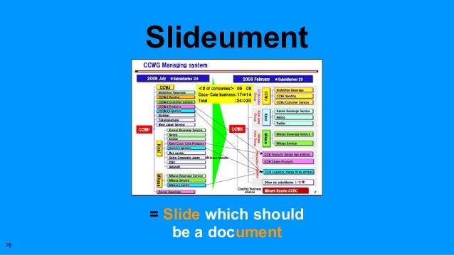
I’m not naive to think I can stop this trend. I’ve created my fair share of slideuments too. People don’t like to read and slides are enticing: bullets, diagrams, charts, and images all help boiling down complex topics. While I think a word document with bullets, diagrams, charters and images is better, I understand many people are now conditioned to see slides. So, if you must create slideuments, here is a good Illustrative Example of an slideument
Source:
slide:ology: The Art and Science of Presentation Design by Nancy Durante


