Creating a good flow diagram to visually explain a process
You don't have to learn UML or follow ISO to create good flow diagrams.
[Note: Last month, I experimented with creating a podcast using synthetic voice. I’m ending that experiment because it was too much work and not enough engagement. If you want to listen instead of reading, I’m recommend audiblogs, a Chrome extension for listening to any article in your browser.]
I wrote about story maps to showcase a good technique to break down a user journey into bite sized pieces for writing user stories. But what if you need to visually decompose an internal business process that the user doesn’t see? What if you had to explain any process or algorithm visually? Introducing the flow diagram.
What is a flow diagram?
A flow diagram (aka flow chart or process flow/map/chart/model/diagram) is a visual representation of a set of activities. As with anything visual, there are a lot of variations with specific names and different purposes. The International Organization for Standards (ISO) even has a standard “ISO 5807:1985 Information processing — Documentation symbols and conventions for data, program and system flowcharts, program network charts and system resources charts”.
Why care about learning flow diagramming?
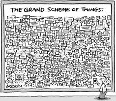
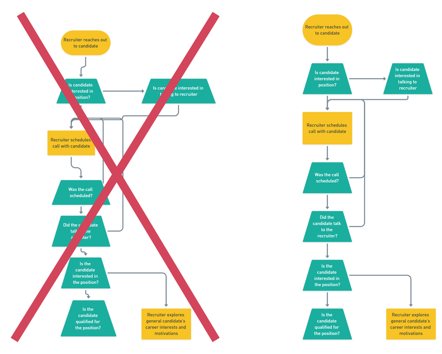
At a glance, creating a flow diagram isn’t hard. From the images above, you can learn by imitating. It’s boxes, lines, and words. However, through 10 years of creating flow diagrams, I’ve developed some principles from trial and error. What I’m teaching won’t conform to ISO 5807:1985 or Unified Modeling Language (UML), but I believe the trade-off is good enough at most startups starting out.
3 Good Flow Diagramming Principles
Make information comprehension easy for people.
Early in my career, I used to push the adoption of ISO or UML. But I’ve learned, most people who read your flow diagrams aren’t trained on those standards, which means you always have to start with training.This doesn’t mean training and standards are bad. However, even Ivar Hjalmar Jacobson, a major contributor to UML said, “UML 2.0 has become very large, it has become heavy, it's very hard to learn and study.”
You’re creating a flow diagram to help with comprehension and understanding. It doesn’t help if your flow diagram causes more confusion or you have to spend 30 minutes teaching “how to read” before covering the actual activities the flow diagram tries to explain.Use fewer symbols so it’s easy to update.
At a startup, lots of processes change…all the time. Hell, your company may pivot to another business entirely. This means most processes aren’t locked in stone so you’ll have to update or create new processes. It doesn’t benefit you if you’ve spent time creating a flow diagram only to throw out the majority of work 2 months later when a new process is introduced because you can’t easily update it. That’s why you want to use the least amount of work to communicate the information by using fewer symbols, colors, lines, etc. Furthermore, keeping it simple will also improve readability and comprehension.
Be tool agnostic. (e.g., Pen/Paper, Visio, Lucidcharts, Whimsical, Diagrams.net)
You can use many different tools to draw a flow diagram. From pen and paper, Figma, to Visio/Lucidcharts, good software can help you “speed up” the creation process by providing easy drag and drop templates or auto-formatting lines. However, it can also slow you down by providing too many options. Better to be tool agnostic. Coupled with principle #2 of simple, what you learn can then be used in any tool.
Steps for Creating Good Flow Diagrams
Start crafting your process by focusing on the happy case. No first draft flow diagram looks beautiful. It’s going to look messy and confusing. That’s okay because your first draft is for yourself and it’s meant to help with thinking. One step you can take to prevent yourself getting caught up in the weeds is focusing on the “happy case” or the ideal process. Any time you find your saying, “what if this happens”, write that down and come back to it after you’ve finished crafting the “happy case” process.
Format after a few drafts. After defining the “happy case” and addressing some edge cases, it’s time to think about formatting. Formatting’s goal is to remove excess so the main story pops by improving comprehension.
Have a start and end. After working on your flow diagram for a while, it’s natural for you to know how to read and navigate. But does someone else know where to start reading? Introducing the terminator symbol. You should have two of these suckers, one at the beginning and one at the end. End is just labeled with “end”. For start, follow “start: [short process name]” (e.g., “start: reviewing user uploaded documents to verify identity”).
Use 3 symbols. Recall principle #2?
I recommend sticking with just three to start. You’ve already met the terminator symbol. Now meet the process and decision symbol.
Why these three symbols?
You can always add more symbols. However, in exchange for this higher fidelity, you’re also adding complexity because the reader has to understand what the symbol means.
I’ve found that in 95% of the cases, these three symbols are good enough when the goal is not 100% detail. At early stages of defining a process, it’s not about getting to 100% of the details.
For those who know about flow charts standards, you’ll notice I’ve broken rule by using the trapezoid instead of diamond as the decision symbol.
This is so you can write more words without word wrapping or resizing the box. It also reduces the need to abbreviate words. But it’s okay to you want to stick with diamond.
Three symbols allows you to keep your color palette to a minimal, so your flow diagram doesn’t look like a Christmas tree.
Keep everything top to bottom, then left to right. Follow the way people read. It’s easier so don’t make flow diagrams that read from bottom to top, starting in the middle, or from right to left. As an added bonus, if you are strict with this convention, you can also remove arrows or descriptive text on lines because the next step is always below the present one.

Notice you have to write “Y” and “N” for decision points, add include arrow lines is you start horizontally. See also how the red “Y” and yellow “N” go to the same process. Let’s redo the above diagram to be strict top to bottom, left to right.
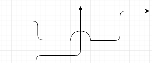
Keeps connecting lines straight and don’t intersect lines. Intersecting lines, even ones with arcs, require additional processing for the reader.
Equal width and spacing. Consistency is the key. Same spacing and sizing of text, including between symbols. Do this step last and it’ll reduce the feeling of “clutter”.
Don’t abbreviate text. There is a tendency given the symbol size to limit what you write by abbreviation. Don’t do this as abbreviation always will cause confusion for someone.
Special thanks to Mahssa Mostajabi, SPM @ Candid for feedback in making this article possible.
Source:


