Creating visual, low or medium fidelity prototype for non-designers.
What do you do if you're not trained as a designer?
I think there are three basic tools PMs have to decompose an idea. Written, using “press release”. Exploring processes via a flow diagram. Mocking up experiences via low or medium fidelity user prototypes. For PMs who aren’t trained as a designer, how do you create a prototype?
What is a user prototype - in software?
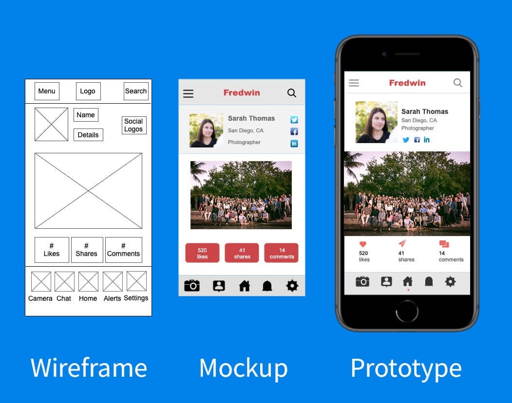
A user prototype is a simulation of a software application. Unlike mockups or wireframe, which are still images, prototypes mimic working software via interactivity.
Prototype presents to users what I like to call “one screen at a time” experience. As George Abraham, SPM @ Infragistics wrote, “When was the last time you launched an app and viewed all possible screen states and user flows at the same time?”
Why care about creating prototypes?
Andrew Tsao, PM @ Groups said it best. “Sometimes, it’s hard to completely envision [something] in a flow diagram [or with words]. By trying to create a prototype, you’re further decomposing the idea, which will help with:
identify errors or gaps in an user journey that wasn’t obvious in a flow diagram or written “press release”
improv communication (i.e., prototype as specification) with others about the idea
“[Furthermore if you’re strapped for engineering resources,] prototypes for first iterations frees up bandwidth for your engineers to work other technical areas such as technical debt or architecture,” said Andrew.
How to Create an User Prototype?
Define why you’re creating the prototype. Sounds obvious but prototypes can have several different goals. The most common is you want to perform user testing with potential customers or users of the software to learn quickly and cheaply before starting software development. However, it’s also possible you’re creating a user prototype to help communicate to other builders (e.g., engineers, designers) or validate the idea (i.e., will someone pay for this?). Defining your goal helps you either reduce scope or be aware of scope creep.
Distill the most important features you’re going to prototype. Scope creep during the ideation stage can grow quickly. It’s an iterative process because you’re ideating and evaluating. One way I’ve found helpful is to create a flow diagram for each feature describing what the user will do, step by step. This will help tremendously in evaluating the complexity of your feature and thus your prototyping effort.
Picking a tool. When it comes to creating a prototype for software products, there are different tools you can use. I’m going to categorize them into three types and argue concept or functional-oriented are the right tool for non-designer PMs.
Design-oriented (e.g., Sketch, Figma, Axure, Adobe XD, and Adobe Illustrator). Great, full functional design tools that can do “it all”. These tools are primarily geared towards design professional or aspiring professions. For non-designers, the learning curve is steeper so you'll spend more time learning “how to” vs. creating the prototype. Furthermore, some of the tools like Sketch, don’t have interactivity built into the tool so you’ll have to use another tool like Invision to “stitch” together the mockups you’ve designed. Too much work for non-designers.
Concept-oriented (e.g., Proto.io, Framer, Marvel): These are tools specifically for prototyping. You can perform visual design work within the tool, but the focus is connecting “interactions” quickly to simulation working software. For native app prototyping, they often will allow easy deployment to testing on mobile devices without the necessary Apple or Android review and approval process. Furthermore, frequent interactions (e.g., user login) are often pre-built via templates. Unless your idea is a new way for users to register and login, do you really need to prototype this feature from scratch? Lastly, while the tools have some of the same features as the design-oriented, they are generally simpler and lower learning curves. It’s a good option.
Functional-oriented: (e.g., Websites/Web Apps: [Webflow, Umso, Squarespace, Wordpress, Weebly, Wix, Bubble] Mobile Apps: [Kodika, Thunkable, Glide, Adalo). These are tools that are meant to build a working “something”, whether a website, web application, or native app. Typically, the interface is WYSIWYG, with some providing low-code functionality for advanced users. Unlike concept-oriented tools, the ultimate goal with these tools is to “make it work”. Because it’s focused on making it work, there are templates you can easily use to speed up the design process, especially when it comes to selecting a visual style (e.g., color, font, illustrations). Furthermore, the WYSIWYG interface makes building a prototype easier. While the tools have many design constraints compared to design-oriented tools, it’s good for prototyping many interactions.
Design “mockups” (a.k.a. screens and pages”) before handling interactivity. It’s easy to start crafting sexy interactions (e.g., what to display after an user clicks into an input field, how to animate a button). Don’t get caught up in the tooling. Instead, focus first on mocking up “screens and pages”. It doesn’t have to be visually pretty, but once you’ve mocked up a few “screens and pages”, then hook up the interactivity (i.e., what happens when someone does ABC).
Put in front of friendlies to test without, then iterate. Prototypes are ideas in action. But first version prototypes have all kinds of holes, and I don’t mean visual. Recently, I made the prototype. After the user clicks a button “Generate your adventure”, some text displays below.
I placed this text simply too far down and didn’t auto scroll to bring it to the users attention. I thought it was obvious, but two quick user tests right away demonstrated user confusion. “Why didn’t the button do anything?” In summary, test often and iterate your prototype by performing the minimum amount of work. Then, show some people, even none target users.
Final Thoughts on Creating Good Prototypes
It’s okay to have multiple goals and shift.
At the ideation stage, it’s not always possible to limit yourself to one goal. Often, you’re trying to flush out the idea, get something working to conduct usability testing with users, communicate to others, and validate the problem is a big enough pain point. When you have this many goals, it’s best to prioritize them for your prototype build. That way, as your idea stage shifts, you can shift your priority as well.Not the right tool: (e.g., Balsamiq, wireframe.cc, or Visio, OmniGraffle, Lucidcharts, Diagram.net) These tools can be used for prototyping, but shouldn’t because there are better tools as listed above. Tooling has advanced that for non-designer PMs, you should rarely need to create a wireframe. Instead, you should be able to create a mockup.
Don’t treat visual designers as UI, UX, or product designers.
See Stakeholder management series: Tips for working with designers. This means when creating the prototype, you’re playing the role of the UI, UX, or product designer. You can still collaborate on the interactivity. Usually, concept-oriented tooling is better because it’s closer to design-oriented tools a visual designer will use. Lean into the visual designer for what they do best, which isn’t UI, UX, or product design.When working UI, UX, or product designer, use prototypes to communicate. Unlike the note above, in this case, you’re working with someone who is more of an expert than you. Thus, use the prototype as a way to communicate, not as a way to dictate the interactions.
Be careful of the interactivity and animation rabbit hole.
Tools can present all different manners of interactivity and animation, from page slides to 500ms delays of slide out transitions. These are fun to program and get it working, especially for builders PMs. But don’t get caught up in this. Few users are going to give you shit because you didn’t pick the right transition. Instead, keep it simple and use the extra time on improving the words you use on the page.Starting with the easiest functional-oriented prototyping tool if you’ve never created prototypes before.
There’s not shame if you’re just starting to learn. “I’ve definitely heard of PMs who jumped into Webflow or Bubble and immediately get turned off because it still takes a little investment,” said Andrew. Thus, if you’re more comfortable navigating Google Sheets/Excel, Notion/Docs, and Slides/PowerPoint, Andrew recommends Carrd, Pory/Softr as tools to get your feet wet.Take feedback in context.
Every person you show the prototype will give you some feedback. It’s especially common to receive visual or content feedback. But if the goal is to the prototype’s usability, visuals and text matter, but matter less. Thus, focus more on the flow of your application, which is why I recommend creating a flow diagram in step 2. Does the flow make sense for the user? Was the user able to navigate to complete the task without your presence? Being observant of the type of feedback will help you with your prototype iteration.
Special thanks to Andrew Tsao, PM @ Groups, for pre-reading and providing feedback.
Sources:


